College of Liberal Arts & Sciences website
Project overview:
The College of Liberal Arts & Sciences at the University of Illinois needed an update to their existing web presence. The old site’s design did not align with the campus or college brand and the current CMS was clunky and did not allow editors to easily add and update content.
The goal for this project was to design a theme that will incorporate more campus branding elements yet allow the college to stand out as their own entity both among peers within the university and other Liberal Arts colleges.
My role as lead designer/developer was to design and implement a CMS theme for Drupal and system of components that could be used by content editors to create web content and page layouts. I collaborated with the college’s lead print designer to incorporate elements of the college brand into the web theme.
Project duration: 2018-2019
User research
My role as lead designer/developer was to design and implement a CMS theme and system of components that could be used by content editors to create web content and page layouts. I collaborated with the college’s lead print designer to incorporate elements of the college brand into the web theme.
Pain point: Outdated design
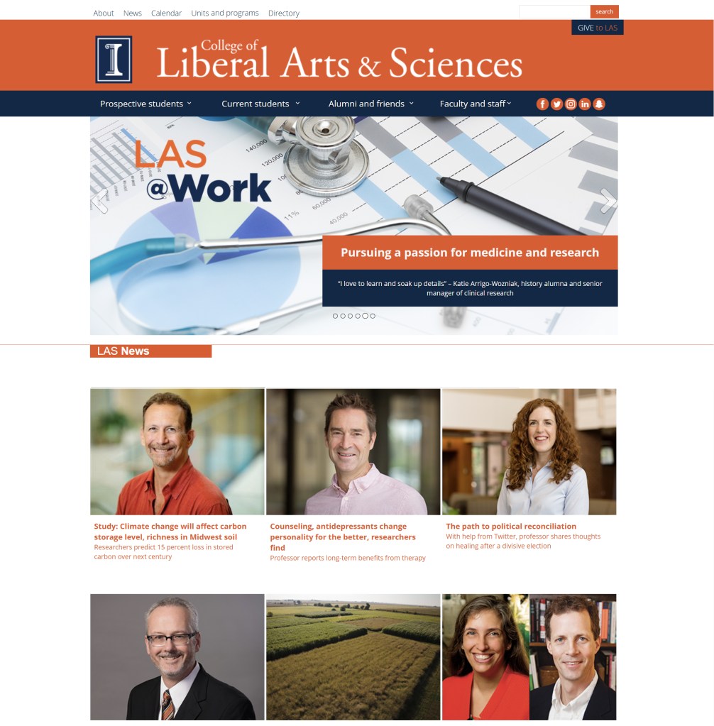
The current website was over 5 years old and did not reflect the current branding used by the college. It also did not match the look of other recently updated unit sites.
Pain point: Editor experience
The current website was using a combination of custom applications to update content. We needed to move it to a standard framework that could be easily updated and maintained from a central location.
Pain point: Navigation and messaging
Messaging and information hierarchy was not set up to center around student recruitment and navigation needed to be targeted toward multiple audiences. The college had recently created a new branding and messaging campaign that would also need to be incorporated into the web site.
Pain point: Accessibility
Using updated accessibility standards, we needed to create a design that was usable and accessible.
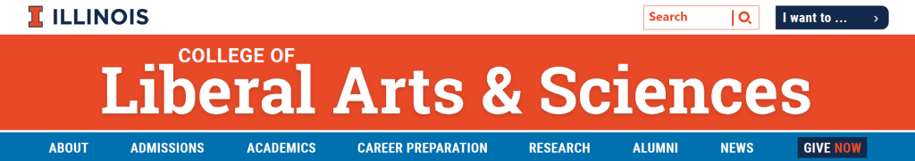
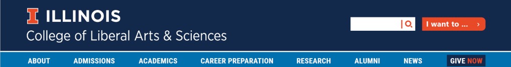
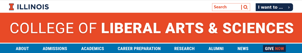
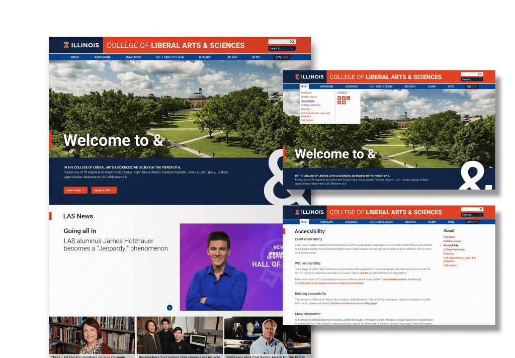
Design iterations
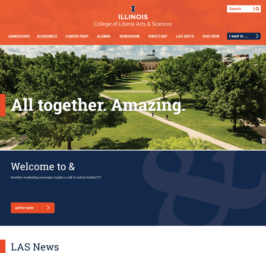
The first iteration put focus on the header and menu structure. I worked closely with the marketing department to create categories that would focus on student recruitment and make it easy for students, parents, and faculty to find information.
The second iteration was more magazine-like. I kept the audience-focused navigation, but worked closely with print designers to incorporate some of the branding elements that were consistent with printed materials.
We further experimented with different header styles and color combinations. Eventually defaulting to a header style that combined elements from the university and college. During this redesign, the university updated the colors for their brand which we incorporated into the new site.
Components and page layouts
To keep the branding consistent and still allow editors to create unique and dynamic page layouts, I created different components that could be combined on a single page.
Content could be presented in two- and three-column layouts.
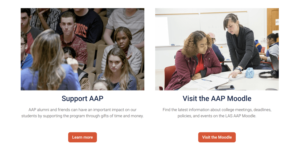
Themes, colors, and fonts were predefined and styled to fit within current brand standards.

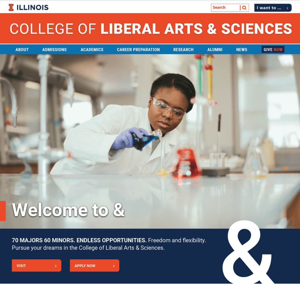
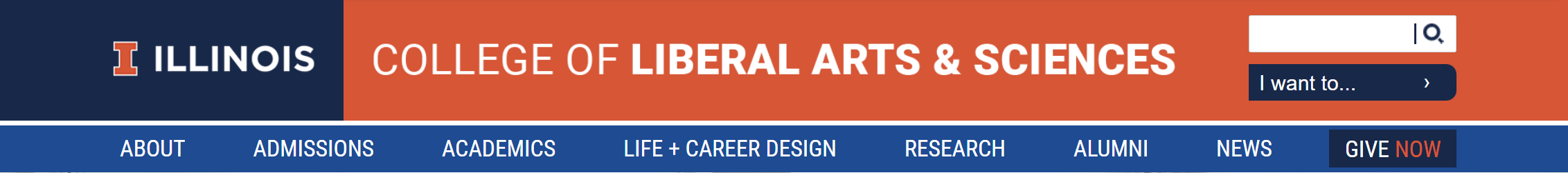
Final iteration
Overall, the college was pleased with the finished design. The website was now cleaner and more usable for our audiences and had a stronger tie to the university brand. In addition, site editors were able to create dynamic layouts and more easily make updates to their content.
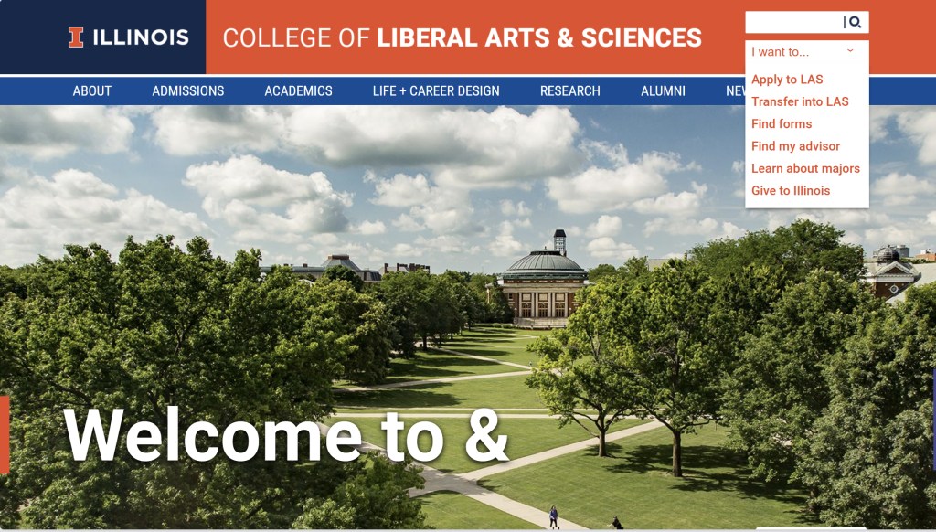
The “I want to…” menu allowed different audiences to quickly access highly trafficked areas of the website. To avoid this menu turning into a “catch-all” we were very specific and intentional with what we chose to highlight.
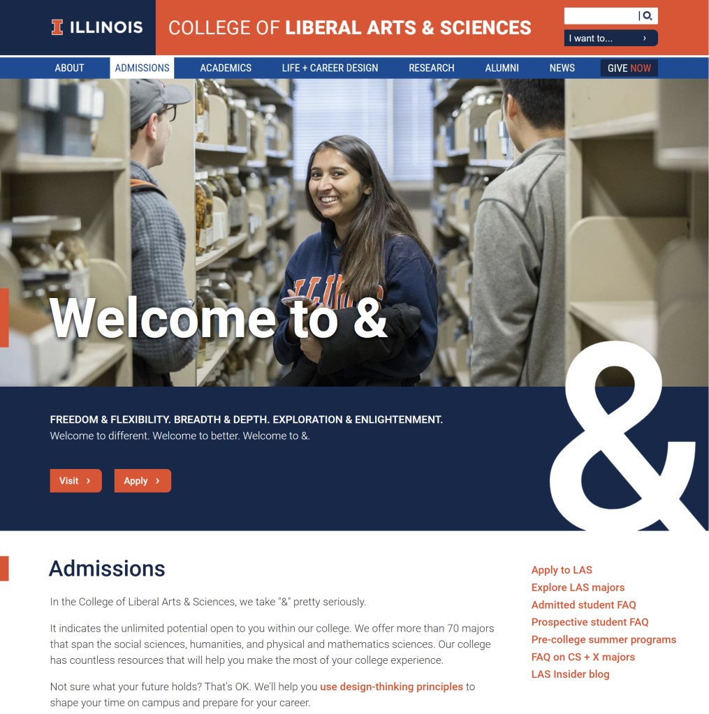
Components were combined to create unique layouts for landing pages, news stories, and content pages. Editors appreciated the flexibility and felt empowered now that they could create unique, branded layouts using the CMS.
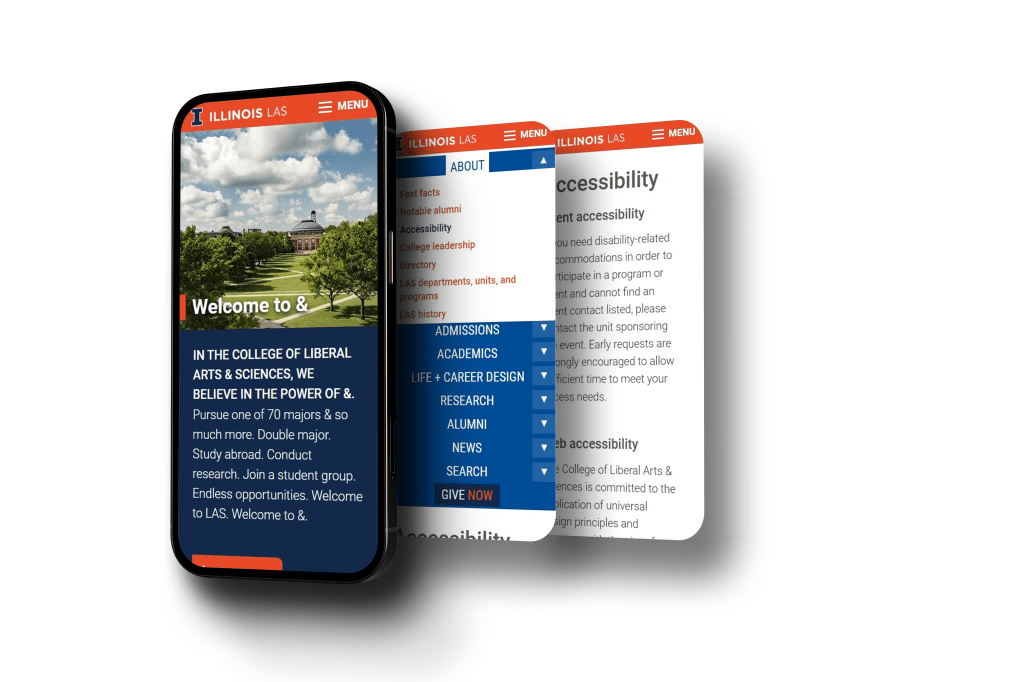
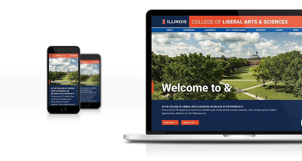
Responsiveness was also a large part of the final site design. A custom menu for mobile was created, keeping in mind touch points, margins, and readable font-size.
 Maggie Jarvis