Tents ‘R Us mobile website
Project Overview
This was a student project I completed as part of a UX Design Certificate program. The prompt I received for this project was “Design an app and a responsive website for a camping supply store to advertise and sell its products.”
Through user personas and competitor research, I came up with a problem that could be solved through UX. The problem was that novice campers did not feel confident or knowledgeable enough to choose the right equipment for their level of camping experience. Experienced campers found the choices to be overwhelming and not correct for their level of experience either.
The goal was to simplify the search process for campers and outdoor recreation enthusiasts of all experience levels.
Responsibilities:
- Conduct user research and define personas, user journeys, and user flows
- Define the problem and provide insights to inform the ideation phase
- Visual design of low-fi and high-fi wireframes and prototypes
- User testing
Project duration: March 2024 – August 2024
User research
I created user personas to better understand the target user and their needs. Through creating empathy maps and user journeys, I was able to identify potential needs and pain points. I discovered that there are many different levels of experience and confidence associated with outdoor recreation. My goal was to simplify that experience and increase the user’s confidence when purchasing camping supplies.
Pain point: Information overload
Novice campers were overwhelmed with the different options and specifications for equipment.
Pain point: Confusing navigation
Users were frustrated with the inability to filter information to find the equipment they were looking for.
Pain point: Limited knowledge
Novice campers did not have enough knowledge to feel confident in the equipment they were buying.
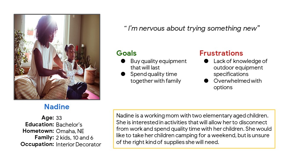
Problem statement: Nadine is a working mom who needs to purchase quality camping supplies because she wants to spend quality time with family.
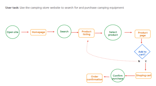
Through my user flow, I wanted to illustrate how users would accomplish their goals and identify and pain points along the way.
Ideating and prototyping
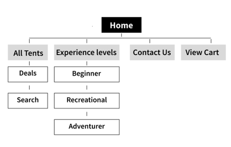
I started by laying out a user-focused navigation that would not overwhelm hinder the flow and allow the user to successfully complete their objective of purchasing a tent.
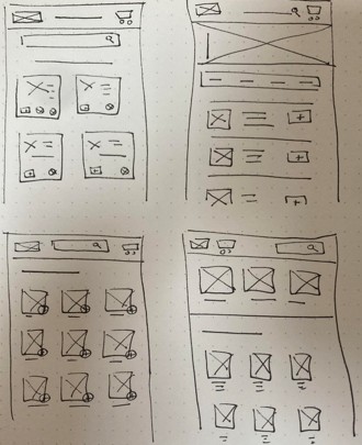
Keeping in mind my goals for the end user, such as navigation and organization, I sketched several different layouts and iterations.
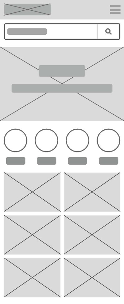
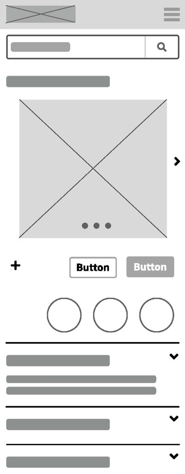
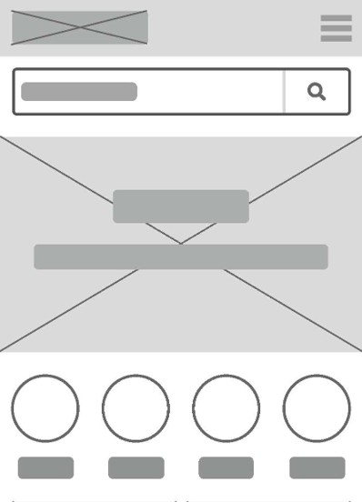
Using wireframes, I translated my paper sketches to a more structured digital format. I incorporated categories on the homepage that would tie directly to product pages. These categories would help to further organize the site and create a more user-centered navigation system.
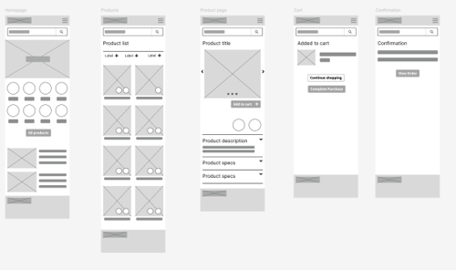
To create a low-fidelity prototype, I mapped out a simple user-flow starting with the homepage, moving to the product page, then adding an item to the cart and checking out.
You can see an example of this initial prototype in my Figma project.
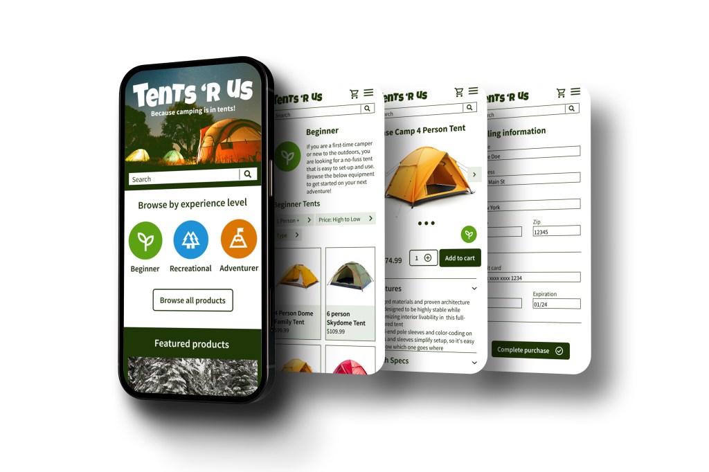
Finalizing the design
Based on the insights from my low-fidelity mock-up, I cleaned up the homepage, added my logo, icons, and images, and improved the user flow.
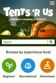
I created a high-fidelity prototype with additional options for a user flow. I also added images, content, and branding elements.
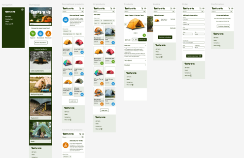
You can see an example of this hi-fidelity prototype in my Figma project.
